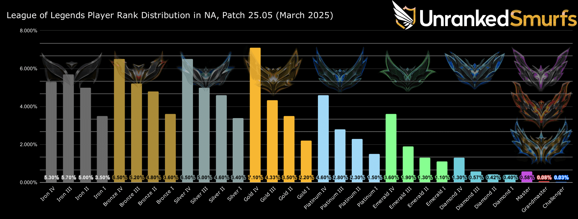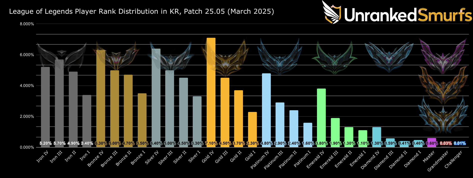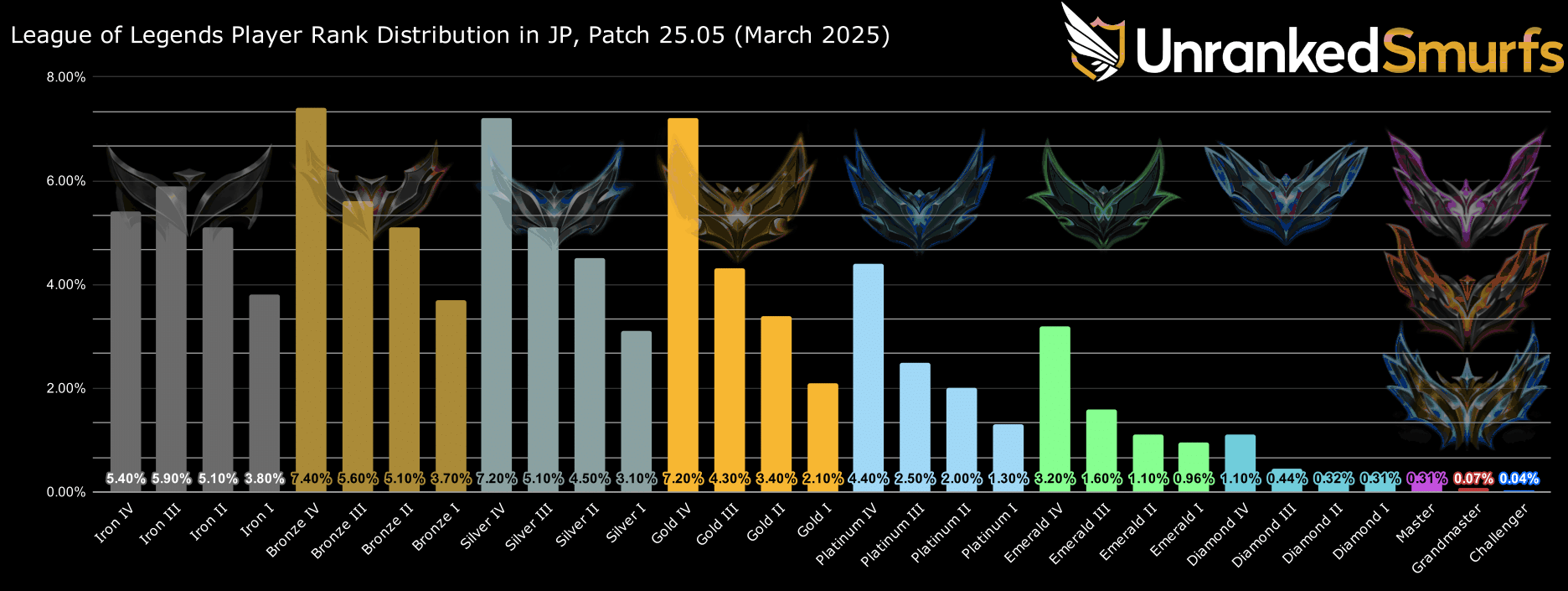
When you hit a certain rank in League of Legends, it's not rare to want to see how many people are above you. The League of Legends rank distribution is available through the Riot Games API. Once downloaded, the data can be manipulated to create graphs which show the distribution curve for the League of Legends ranks base across the entire ranked system.
We downloaded the data for 4 different regions (Europe West, North America, Korea and Japan) and created the graphs below using the % of players in each division. The graphs mostly follow the same pattern, but here are some of the more interesting trends that we found:
Some specific regional trends also include:
I mean it's been weeks since rank reset, and we still have no challenger in this server according to u.ggwhen I changed my region to MENA I didn't think my queues go up to 5-9 minutes per game.


Japan, despite being a newer server, has by now settled into the distribution we've come to expect—similar numbers to other regions, with healthy bumps at the start of each division. These are good signs for a newer server, and evidence that it's performing well within the League of Legends ranking system.
Japan does, however, sport a larger population in Bronze compared to Gold, which points towards a newer player base who's less proficient at the game and still starting to build their game knowledge.
Maybe.
The data is still not necessarily conclusive, and data points might have interesting origins and effects. For example, by seeing that Korea has a lower population in high elo compared to NA, one might end up with the conclusion that the average Korean player is worse than the average NA player. While this could be true, it's more likely that the average Korean Silver player might just be better than the average NA Silver player. Most people ranking lower does not necessarily equate to them being worse, but it may instead equate to the competition in that queue being harder.
For this reason, we can assume that servers with lower high elo populations tend to have less rank disparities and more population, which means you will be more often than not matched with people of your skill level. This leads to a more competitive ranked experience, where the average player's MMR tends to align with their current elo and league points (LP) earned in each ranked game.
Ideally, every ranked match has enough users near your MMR to match you. Problems only arise when there's not enough users to choose from, and players from higher or lower elos are added to the match. And, of course, this changes the total team's MMR, which means the circumstances for who you are queued up against are also altered. There's a lot of math going on in those 30 seconds before you're able to find a game.
JP gives us an interesting look at how a region’s ranked distribution changes over time. The old school servers (NA, EUW, and Korea) have been around for an extremely long period of time which means they've had multiple League of Legends ranked seasons for their ranked distributions to settle and they create the curve that we've come to expect. The Japanese region stays in a half-cocked state, and newer regions such as ME show what a server looks like in its infancy.
If you want to learn more about the factors that could influence your personal rank, be sure to check out our article on the subject, which also explains how MMR, LP and the LoL ranking system work together, and explains the path from playing normal games to reaching the highest ranks in both the competitive scene and the ranked ladder.
In general, this distribution of steps divided over the first division in a tier, and around 80% of the population sitting between Iron and Gold proves the same for the Ranked Flex queue. Aside from higher competitiveness in higher elo, and Ranked Flex having a higher skew towards Platinum due to its lower population, the distribution remains the same as the Solo Queue ladder within the broader ranked system.
